 English
 العربية
 Deutsch
 Español
 Français
 Italiano
 Português
 Русский
 Türkçe
 اردو
اردو
 Tiếng Việt

Simulate Website on Different Screen Sizes
Simulate and Test Website Appearance Across Different Screen Resolutions


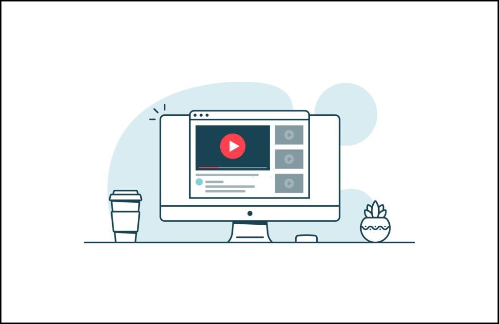
Screen Resolution Simulator is a free online tool that allows you to simulate different screen resolutions directly in your browser. It helps you preview how your website or design appears on various screen sizes such as desktop, tablet, and mobile devices.
This tool is ideal for web developers, designers, testers, and website owners who want to ensure responsive layouts across multiple resolutions.
How to Use Screen Resolution Simulator
-
Enter or select a screen resolution
-
Click the Simulate button to preview layout
-
View your website in the selected resolution
-
Use Sample to load a demo resolution
-
Use Reset to clear all settings
Available Buttons
-
Simulate – Simulates the selected screen resolution
-
Sample – Loads a sample resolution for testing
-
Reset – Clears all input and simulation data
Why Use Screen Resolution Simulator
Different users access websites on different devices. Simulating screen sizes helps identify layout issues and improve user experience.
This tool saves time and helps build fully responsive websites.
Key Features
-
Simulate multiple screen resolutions
-
Preview layouts instantly
-
Three-button interface (Simulate, Sample, Reset)
-
Fast and accurate simulation
-
No software required
-
Works on all modern browsers and devices
Security & Privacy
Your data is completely safe. All simulations run instantly in your browser. No URLs or information are stored or shared.

Editorial Staff
About the Editorial Staff
Editorial Staff at Spot Web Tools is a team of specialized content writers that strives to share quality and unique content. Our Writer's main objective is to cover the different aspects of technology and to help you use the internet more effectively.
Popular Tools
Recent Posts